Well, well, my funky old $20 phone (which I bought with the intent of it being so cheep it's "disposable") suddenly crashed and entered a reset loop / auto shutoff sequence during my campus tour of the University of Florida. I only bought it about 1.5 years ago and my real usage time on it hadn't even exceeded a year (taken I've had it laying around useless when I was in Taiwan), even for a cheep phone, this life time is kind of short. But oh well, it works very well, had very good reception and never had any problems during it's lifetime. And besides, it really looks like a toy, clearly designed for kids, which makes me kind of ashamed to pull it out in the public. So, it died, just the excuse for me to get a new phone.
Virgin Mobile has worked very well for me. Being a prepaid service, with my very low phone usage, I get to pay only $15/3 month, which averages to just $5/month. Compare that with normal contract based monthly plans at $30 and up, and they always add additional fees and taxes to make you pay $5~10 more each month then what they advertised. Oh, and don't forget that expensive activation fees and stuff upon signing the contract. With all of that adding up, I hate the big greedy telecos, and as shown in Consumer Report's (CR) studies, I am not alone in hating them; CR has rated telecos as one of the services industries that consumers hate the most, high up there in the top 2 with airlines. Also, I get to get about an hours' worth of free minutes every month by watching ads on Virgin's website, keeping my balance above $15 year round. On the service part, reception is always good; and I am very satisfied with their customer service, whenever I get to get a real human rep on the phone. Only down thing with them is that they target kids and teens as their customers, so there's funky/stupid icons, images and ringtones preloaded on phones, and customer service calls start with a stupid automated voice going "hay, what's up" in a strange accent.... Will the goods out weigh the bads, so I'm sticking with them on a prepaid plan.
Nice timing, as Target is selling the Kyocera Cyclops for $39 each, $10 cheeper then elsewhere. And it's a nice flip phone with the largest of all those tiny-screen Virgin phones, so I went to scoop it up.
After reading all those phone reviews on Mobile01 by Ln, I'm starting to like the feel of gadgets in an outdoor setting.
So starting with the packaging...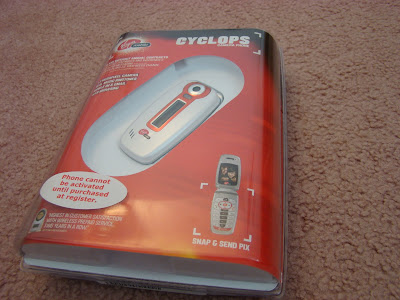
It's those hard-to-open blister packs. Hard to open by thefts, just as hard for paying customers. Every one except the retailers hate them.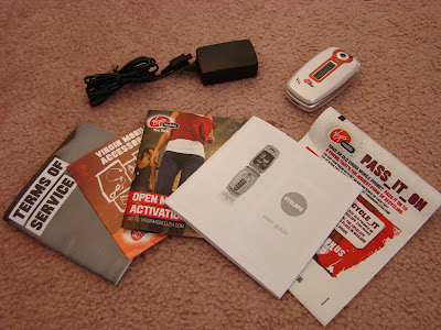
Everything inside. Got the phone, battery (Li-ion, 900mAh which gives the phone pretty reasonable battery life so far. I forgot to take it out of the phone before taking the photo...), travel charger, booklets and ads, and even a neat bag for sending your old phone back for recycling, free of charge.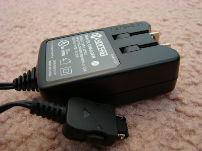
This charger is much smaller and lighter then my previous one. The plug is collapsible , too.
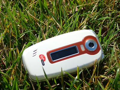
Here's the phone, with a great one-line outer screen.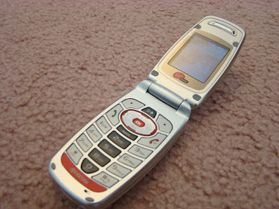
Opened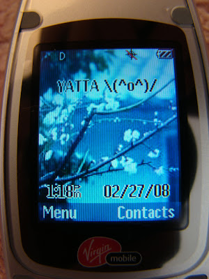
Main screen, with my own wallpaper. The built-in wallpapers were, once again, kid-target hip-hop style and downright horrible. At first I tried to use photos it took with the built-in camera, but the photos are a 4*6 ratio that left the long screen blank on the top and bottom. And besides, photos took with the built-in camera are all pixelated, heavy on noise, out of focus, and (again) downright horrible. It took me a whole afternoon trying to find a way to get my own photos onto the phone, as the for-purchase wallpapers on the Virgin Mobile's website are in the same style of the built-in ones, only worse. I tried all kinds of ways, including websites that put photos on a server for phones to download over the web, emailing it to my own gmail account and accessing Gmail over the phone browser. But turns out the whole download function of the phone browser was disabled by Virgin (hay, I paid a buck for that one day's web access!). In the end I found on the blog that photos can be sent to [my phone number]@vmpix.com , and that email would show up on the phone as a picture message (MMS). Pretty neat, except that each MMS costs a quarter to receive. Also, in the process, I learned that I could send SMS or MMS to any email address from the phone, which would be turned into an email by Virgin's system. SMS uses the [phone number]@vmobl.com address which MMS is @vmpix.com , emails sent to these address converts to SMS/MMS in the same way. A pretty neat way to use email, I like it.
The phone also came with a Java email application that never worked, oh well screw it.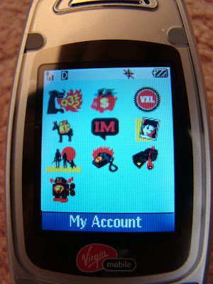
Here's the main menu, with stupid icons. As Cnet's review pointed out, the icon link to view my remaining balance is represented as a piggy bank flying away, (quoting Cnet) "how appropriate"! I know it's again, targeting kids, but I really don't believe kids would appreciate these dumb graphics. Adults tend to guess what kids like and usually screw up.
Close up on the key pad. Buttons are big enough for comfort, but a little shallow on the travel depth of each press. Holding the opened phone to my face was not as comfortable to hold as a larger candy bar, but acceptable.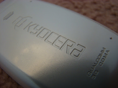
The Kyocera mark on the battery cover, which is a pain to remove. Oh, it uses the CDMA2000 "3G" network, but only utilizing voice/SMS/MMS and slow speed data services, there's no noticeable difference with 2G in the end user's experience.
Over all, I like it. The size is not the smallest, but small enough. Battery life is pretty nice so far. The 65000 color STN screen at a resolution of 128x160 px, although still tiny, is pretty nice for a budget phone (and all my previous phones are budget phones). The Camera is horrible, the worst in noise that I've ever seen. The menus, wallpaper and ringtones are stupid kid fanfair, but at least the outside looks decent, wallpapers changeable, and there are 2 plain ringtone choices. Overall, it's a very nice budget phone. Until I could get a Japanese high-end phone on my hands and working in the US, I'll be sticking with this baby.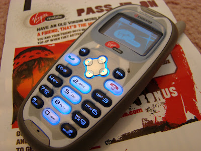
To wrap it up, my old phone, stuck in the Virgin mobile logo of the booting sequence.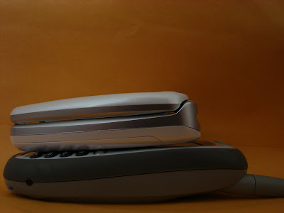 Interestingly, my old candy bar phone is just as thick as my new phone but much bigger in length, even without the antenna. To give it last words of condolence, that antenna really give it better reception then the new phone.
Wednesday, February 27, 2008
VirginMobile Kyocera Cyclops short review
Friday, February 22, 2008
馬英九於BBC Hard Talk 訪談
我想,對這訪談內容,政治上的感想我就不在此發表了,因為事實上沒什麼好說的。
為什麼?很簡單,這反訪談中並沒有實質內容。
不是BBC的節目不好,也不是問題不好。
重點是,大家可以來觀摩一下什麼叫做「答非所問的最高境界」。主持人問的問題一個接一個,全部都沒有得到答案orz
Thursday, February 21, 2008
霜月はるか・カザハネ
今天來介紹一首動畫歌。H2O~FOOTPRINTS IN THE SAND~ 的片尾曲 カザハネ
(太棒了,單曲終於上市可以聽到完整版了)
霜月はるか這歌手就是專唱動畫/遊戲主題曲的,不過完全是個聽了會嚴重上癮的曲風。甜甜的歌聲,配上帶著淡淡東洋風味的民族曲風,在加上各種弦樂器、木笛、長笛、鈴、鐵琴等各種樂器交織出華麗的旋律,又帶著淡淡的哀愁。編曲真是絕妙阿!
歌詞@黑心人形の部屋
沒有ニコ帳號的抱歉了,別的地方我都找不到完整版,只好po動畫片尾版了
Tuesday, February 19, 2008
Blu-ray wins...
Toshiba just announced the surrender of HD-DVD, an end of this interesting high-def-next-gen video disc format war, just 2 years after it started. Sure is fast. Yeah, it's all cool, the fight, Sony's revenge after the loss of Betamax.
But I have one thing to say. I seldom watch TV and don't plan to buy a TV in the future. The internet+PC is the sole method of my home entertainment. Heck, I seldom watch DVDs on my computer. The last video format that matters to me is VHS tapes, after that, LD, VCD, DVD, HD-DVD, Blu-ray, non of them ever played an important role in my life. Some years back there, programs and movies stopped being entertaining.
Monday, February 18, 2008
素晴らしね、京アニ
週四播出的 CLANNAD -クラナド- 第18話 因為去面試,現在才看完。
完全是個可怕的一集。其中好幾幕都把人物表情以高品質作畫表現出來,完全想不透是如何做到的,但看著那些角色的眼睛,就深深的被劇中的情緒感染。看動畫從來沒有這樣的感受,明明是畫出來的畫面,卻有種那表情比真人演員還有感染力的感覺。
後面看網球賽那邊更可怕,各個角色之間表情的對比,配上實力超強的聲優和超棒的配樂,整體組合出超強的情緒感染力,各種情緒之間的矛盾都展現了出來。我只能說,京都動畫太可怕了。
ニコ鄉民說得好:這就是京アニ實力的展現啊!
(警告,CLANNAD劇情不適合某位朋友的心情狀態... )
Wednesday, February 13, 2008
Firefox location box quick search
Here is a little trick I like to use with Firefox.
If you know Firefox, you must know that there is a location box and a search box in the tool bar. You type the URL (website address, the "www.***.com" thingy) in the location box, while you type whatever you want to search (eg. Google) in the search box. Yet I am a keyboard guy and hate to move my hand frequently between those boxes. So I use the location box for everything. In this way, I could also keep the search box locked on Google search and don't have to click on that little icon and switch between search engines.
Thus this is what I do when I need to search. For example, to search for "blog" on Wikipedia, I can just type "wp blog" in the location bar and press enter:
And Firefox takes me there:
Here, "wp" is the keyword for wikipedia search, add a space and what you want to search for and there you have it.
So how does this work?
I have been using Firefox since 0.7 beta, and with early versions, they came with preset bookmarks in a "Quick Search" folder. These search bookmarks have keywords that were already setup so you can type short words (such as "wp" for the whole wikipedia search string) instead of the whole URL of the site.
So, if you don't already have those bookmarks set up, here's how:
On the menu bar, goto "Bookmarks"->"Organize bookmarks" to open the Bookmarks Manager window.
In the new windows, there is a "New Bookmark" button, click on it and you'll get a pop-up window like this:
So, for Google, the default I got is...
So you could type "google ***" (*** is what you want to search for) in the URL box. What's important here is the Location URL and the Keyword. The Keyword is what you use to call the search function. So if you don't like the keyword, change it to what ever you like, just remember what you used. The Name and Description doesn't matter, it's just labels for you to read when organizing bookmarks.
With Wikipedia, it's
Location: http://en.wikipedia.org/wiki/Special:Search?search=%s
Keyword: wp
So, figuring out how it works, here's some handy new ones I made:
For NCBI/PubMed paper search (I love this one!):
Location: http://www.ncbi.nlm.nih.gov/sites/entrez?db=pubmed&cmd=search&term=%sSo type "ncbi whatever" to search for whatever.
Keyword: ncbi
And for Wikipedia Japan:
Location: http://ja.wikipedia.org/wiki/Special:Search?search=%sSo type "wpj whatever" to search for whatever. (For Wikipedia Chinese, change that "ja" in the location to "zh", yet I don't know how to set it to simplified or traditional Chinese)
Keyword: wpj
Happy searching!
Monday, February 11, 2008
Phone Rant
Phone companies are showing off their newest phones at the 3GSM at Barcelona.
Sony Ericsson came out with a new WM phone made by hTC (the X1), a new clam shell Walkman phone W980i, and a slew of other ugly phones. The X1, well, it's cool, it's hTC, it's Windows Mobile. That means the price would be ridiculously high, and people using it would have to deal with all the pain of the start menu and endless popup windows and buttons, even when they are away from their computer. Come on, that "dig-in hell" where you have to keep on pressing "OK" or "next" until what you want finally shows up is really a pain in the ass that you suffer on the PC. Do you really want to suffer more for the rest of the day?
The W980i looks sweet, the clam shell design and big key keypad is great. But hay, 240x320 screen? It's a high end clam shell, why should I still peek through that tiny screen? I want a 480x854 screen now! It's standard in Japan, why should the rest of us suffer tiny screens?
And yeah, all the others are downright ugly, with the screen just as small or even smaller.
Now with Nokia. The N series seems to be more powerful then Sony Ericsson's offers, but hey, the tiny screens, arrrrrrrrrrrg! And also, N series phones are just fat, fat, fat.
What? Moto? Let's just skip that.
The present phone industry is just pathetic, the main reason I am now sticking with a cheepo $20 prepaid phone. Since they all suck (except in Japan and a few in Korea), I am paying the least I can for unavoidable junk.
And don't tell me how great the iPhone is. A touch screen only device looks cool but is a pain to use, and with the positioning of the screen on the device, you get cramped fingers faster then any buttoned phone. And should I point out the screen? 320x480 is still tiny when compared to 480x854, and it would be all smeared in finger prints and face grease. To top it up, you could get 2 Eee PCs for that idiotic price on a phone that weighs style over functionality.
Thursday, February 07, 2008
Biomed Ph.D. Program 面試最常出現那種人?
幾次面試後的心得:
1. 女性
2. 碩士或當過研究助理
3. 已婚
4. 老公是電腦工程師
...
...
...
為何都是電腦工程師... ○| ̄|_
Wednesday, February 06, 2008
萬年錯字
囧了...
車社網站上有個錯字,從我接手改呈現在這版本到現在一直都在那裡。網站是05年寒假完成的,3年後的今天我才發現有錯字...orz
車社活動種類中有個休閒推廣,簡稱「休推」,不過網站上一直是「修推」。
在剛入社還沒動網站前我就聽過有人在討論是哪個「修」了,當時我們還開玩笑說「修推」=「修車+推車」...... 結果網站上3年來都是「修車+推車」,有夠悲情... T_T
怎麼都沒有人跟我講啦?
Tuesday, February 05, 2008
マック本・空気 hands on & アイポード触れる音質テスト...

The MacBook Airs are now in Apple stores.
First thing I did after noticing it in the store, is shut it, and see how thin it is. Well, it's nice, but I don't know why I don't feel any "WOW" or astonishment. I hold it up, horizontally. A thin slab of metal. Feels more like an over sized kitchen knife. Okey. Sometimes some weird expectations make weird feelings. Instead of feeling "Wow, what a thin notebook", I felt more like "oh, this kitchen knife is a little too big for comfort..." Oh, and the weight also confirms with what I'd expect from a kitchen knife, too. It's of course, light when compared with a MacBook, yet not light enough to surprise me. Simply put, the Vaio TX did surprise me with it's lightness, the MacBook Air didn't; although they actually weigh similarly, the overall visual feel do has an impact to what you'd expect it to weight, and that, then affects wither you are surprised or not. But then, they would both feel much more different in backpacks, which of course is impossible to test in stores.
What did surprise me is the flat sleep signaling LED and Apple remote IR receiver window. They are now so thin that they seem more like little cracks. It looks very cool, yet it is now even harder to see if the computer is in sleep mode or not. Another looks overriding functionality design choice by Apple.
Something else notable is that there is a thin rubber seal around the screen to make the lid/keyboard fit each other nicely.
The 2 holes on both sides of the iSight camera are now 2 grids of holes, more like a bee hive.
The new cylinder shaped Magsafe connector looks great and seems to have a more sturdy construction. I wish I had that one with my MacBook.
The out of the box system is very smooth and responsive, much smoother then my MacBook CoreDuo. Hay, didn't someone say that the MacBook Air is slower then MacBooks? Well, first of all, it's the out-of-box configurations, so there is no large softwares for me to try. Second, although my CPU is slightly faster, it's an older generation, and the Air's got 2gigs of RAM. (I've only got 1gig.) Anyhow, realizing that the Air is faster then my MacBook made me slightly pissed for a split second... (想掀桌啦!)
Overall, it's a nice machine, yet at that price and only 1 USB port, it's not something worth buying unless you've got money to burn.
Oh, I saw this girl in the store pointing at the Air saying this is what I want, and her grandmother just went "you tell me what you want and I'll buy it for you!" Okey, so that's the situation when over priced stuff gets to be sold. (Hay, is that the right way to rip off your rich grandparents???)
---
I also brought my own headphones over to test the sound quality of the iPod touch.
Well, at first it felt pretty well. The sound wasn't as great at what some people say, certainly not the best, yet not the worst either. Reminds me of the entry level Panasonic portable CD players that played flat sound. I think this flaw would be unnoticeable to most people.
But here's the ugly part. I turned the unit to switch the screen over to landscape view. Well, guess what, I heard a pop of static noise when the screen flip occurred. The "pop" didn't occur every time I flipped the unit, but it is downright annoying when it did. The pop also occurred on every tap of play and stop. This reminded me of the days of playing MP3 with Winamp on Pentium 100MHz computers with Windows 95. Oh the days of inferior music playback when every Windows event that required some work of the CPU would put "pops" of noise in your music. I am used to my Sony Clie with a dedicated MP3 playback chip so that nothing except a system crash would interfere with my music. So a gadget that was meant to play music having this PC-like behavior is totally unacceptable. Now I am even more sure that I would never buy an iPod touch.
Monday, February 04, 2008
中時電子報|綠卡絆馬傷謝 卻豐富民主
中時電子報|綠卡絆馬傷謝 卻豐富民主
很驚訝在中國時報這個傳統認知為「泛藍媒體」的報紙網站上看到如此中肯的候選人分析。
馬英九沒有危機處理能力這件事,從他在北市市長任內的「不沾鍋」執政可以大概了解到,但並沒有一次挑戰像這次綠卡事件如此的明顯的突顯出這一點。有趣的是,在此謝長廷主打「馬英九誠信問題」,反而是沒有瞄準要害。「辦事能力弱」才是馬英九的罩門,在謝營主打一個無關痛癢的問題時,算是狗屎運不小心打到。
反觀對於謝長廷的批判。文中講到他太過武斷這方面我之前沒注意過,不過這缺點不像馬英九那個那麼大。並不是說謝長廷就比馬英九好,而是本文沒有批判到謝的最大缺點:沒有政見,只有選舉招式。這點是我對謝的最大不滿。這表示著謝的唯一目標就是贏得選戰,他並沒有把「當選後要如何治理國家」當一回事。這下不就跟當選後只會哈哈大笑「我當選啦」,卻在治國上沒有任何作為的陳水扁類似嗎?322快到了,我完全看不到謝長廷的牛肉在哪裡。
中國時報這一篇,對兩個候選人,從綠卡事件的角度切入,做了精闢的分析。在這個媒體被政黨牽著鼻子走的選戰中算是少數的好文。感謝以電腦程式選文的Google news讓我可以不分藍綠背景的媒體都各看一點。(Yahoo奇摩明顯偏藍,Yam天空偏綠...)
可惜的是,目前為止我還是看不出兩個爛人中,誰比較適合領導台灣。簡而言之,還沒有人提出可以讓自己更突出的優點。


